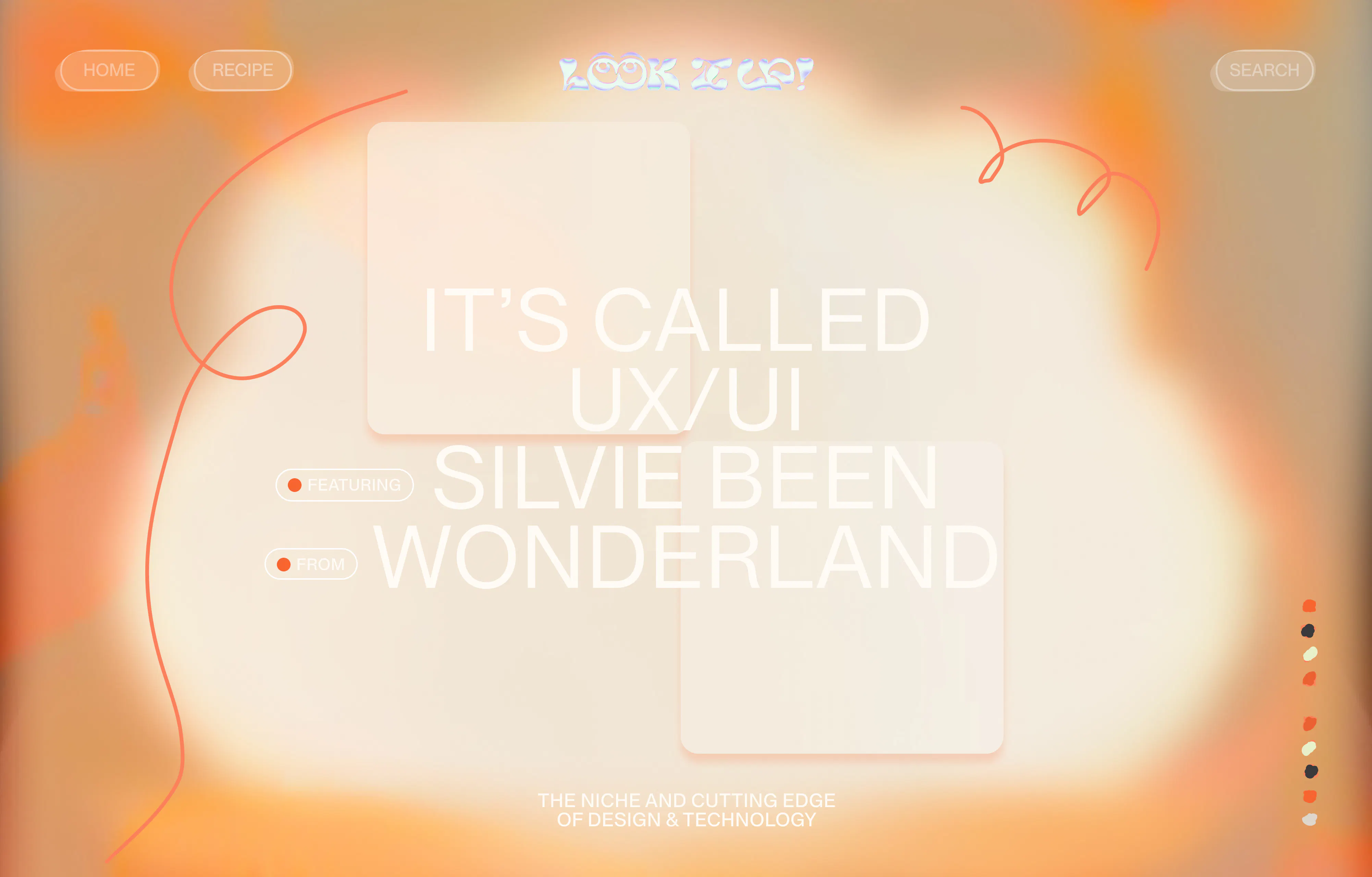
It's called UX/UI! Look it up!
It's called UX/UI! Look it up!
Senior Creative Account Manager
In this edition of Look it up! our in-house UX design expert, Silvie Been, guides us through the flow of UI/UX in digital design and explains why the crucial website flow can help your business grow.
Picture this, you think of what you want to eat for dinner but you're not too sure about how to make a dish your mother used to make when you were a child, so you whip out your phone and head to Google. You type in the name that you call the dish and up pops thousands of website links that have the recipe, each of them fighting for your attention with better use of imagery in that Google link and punch lines. Eventually, you decide to go with the one that has the best picture of the dish, the one that you remember your mother's version looks like. Mmm, you think to yourself “It's going to be so easy to make this” but then you get on to the website and it's a mess.
The recipe and ingredients are all the way at the bottom and there isn't a button option allowing you to “skip to the recipe”. That's a website that didn’t take the user experience into account, which has resulted in frustration and wasting time that will eventually drive people away from your site. Just like you did that day when you jumped off that mobile page and messaged your mum “It's not possible to replicate my favourite meal that you make, can't wait until you cook it for me again”.
Qualtrics conducted a survey that found 80% of the 1000+ surveyed customers claimed that they value customer experience over all other aspects of the technological products and services they purchase.
It is indisputable that user interaction and user experience design has a crucial impact on securing customers' loyalty following each interaction and their connection with a brand. However, what makes these design elements and flow so essential for achieving success in the current digital landscape?
Let us delve into the intricate details of UX/UI design and how they shape our digital encounters with Lead UX/UI Designer at Wonderland, Silvie Been.
Lead UX/UI Designer at Wonderland
What is User Experience Design?
User experience design is all about putting yourself in the shoes of your end-users to create a product that not only meets their needs but also resonates with them emotionally. It's about finding the right balance between functionality and emotions by understanding your users’ pain points and motivation and creating something that people don’t only understand but also want to use. I think user experience should be at the core of any interactive product.
What is the most crucial aspect of UX design?
Empathy. You need to empathise with your end-user to be able to create something that will fulfill their needs. You don’t do that from sitting behind your laptop all day, thinking you’ll know what’s best for your end-user. You need to talk to your audience to fully understand their perspective. Over the years I’ve been really surprised by some of the results conducting user tests. It really showed me to be a bit more humble and not think I know everything the user needs.
Besides that, I think creating a seamless experience that feels natural and doesn’t require too much effort is crucial. In today’s overwhelming world people don’t have time or energy to figure out how to use your product. I believe in some ways designing a digital product can be similar to designing something physical, like a house for example.
Just as we have certain expectations of how things work when we enter a house, we have similar expectations when interacting with digital products. For example, we know how to open a door, and we expect that to be somewhat similar in every house. If the door was designed completely different in every house, it would be exhausting to navigate. The same applies to digital products - users don't want to waste their time and energy figuring out how to use something. This doesn't mean that everything should look the same or be boring. Take Apple, for example. They introduced a completely new way of user experience with the first iPhone design, but it felt so natural that even toddlers know how to use it.
What do you think are some other good examples of User Experience design?
Another example I really like is Slack. Besides the great functionalities Slack has, it’s just designed in a very clever way. It's informal and playful, making it easier for colleagues to communicate with each other on a personal level. Just compare the way you communicate with your colleagues over email versus Slack. I think Slack really changed the way we collaborate in the workplace.
Another example I really like is Duolingo. By adding gamification to the product, the user behavior just changes. Learning a new language can be challenging, but making it fun and motivating through gamification is a game-changer. I've had nights out with friends where one of them was sitting in the corner finishing their Duolingo lesson, saying they had to complete it to avoid losing their daily streak and dropping out of the diamond league. An app that can make people do language classes on a night out is pretty impressive.
The last example I want to mention is Headspace. When Headspace was first introduced, mindfulness was still a relatively new concept in the Western world. For a long time, it was seen as weird hippie stuff. Headspace created an app with UX design that’s approachable, friendly, and no-nonsense and because of that made mindfulness accessible and appealing to a wider audience.
What is one of your favourite UX projects you worked on?
For one of the projects I worked on we did neuro usability testing, meaning we would have users with sensors on their heads that would measure their emotions while using the product. This was a really interesting way of testing, as it can be tricky to interpret results with traditional ways of testing. I thought the fascinating thing here was the difference in culture. For example, Dutch people can be very straight forward and what they said during these tests actually matched to the emotions that were measured. Belgian people on the contrary said they loved it, when we actually measured high levels of frustration.
What do you think is the most challenging thing about UX design?
Finding the right balance in your design. You need to look at the needs of different types of users while making sure that the design aligns with the business goals as well. Besides that, there is a risk of going down a shady UX path just to meet revenue goals, which can be detrimental to the user experience. So the ethical part is definitely something to keep in mind as well.
What’s your favourite thing about UX?
What I love most about UX is that it adds a whole new level of depth to your designs. When I started out as a designer, I would only focus on the appearance of my designs, thinking that was all there was to design. But now I’ve come to realise that how a product works is just as much part of the design as the appearance of it. It has the power to positively influence user behaviour and create a lasting connection between the product and the user making the whole design process a lot more meaningful.

